Revitalizing a French Icon Through Emotion and Innovation
St Hubert, a beloved French heritage brand and market leader in margarine, celebrates its 120th anniversary in 2024with a bold transformation. In a category lacking excitement and clear differentiation, St Hubert partnered with Lonsdaleto modernize its brand identity, clarify its portfolio, and lay the foundation for future innovations.
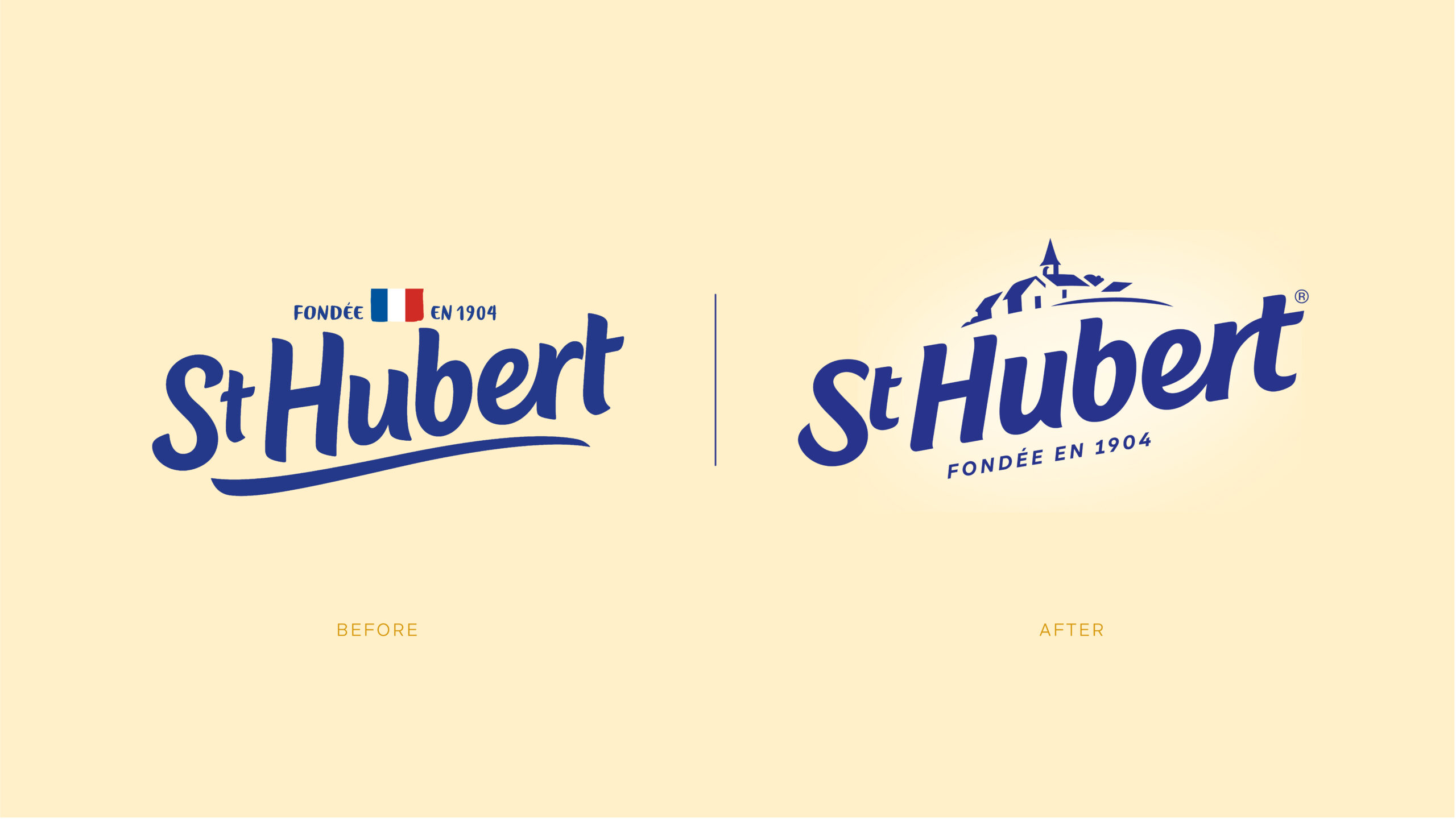
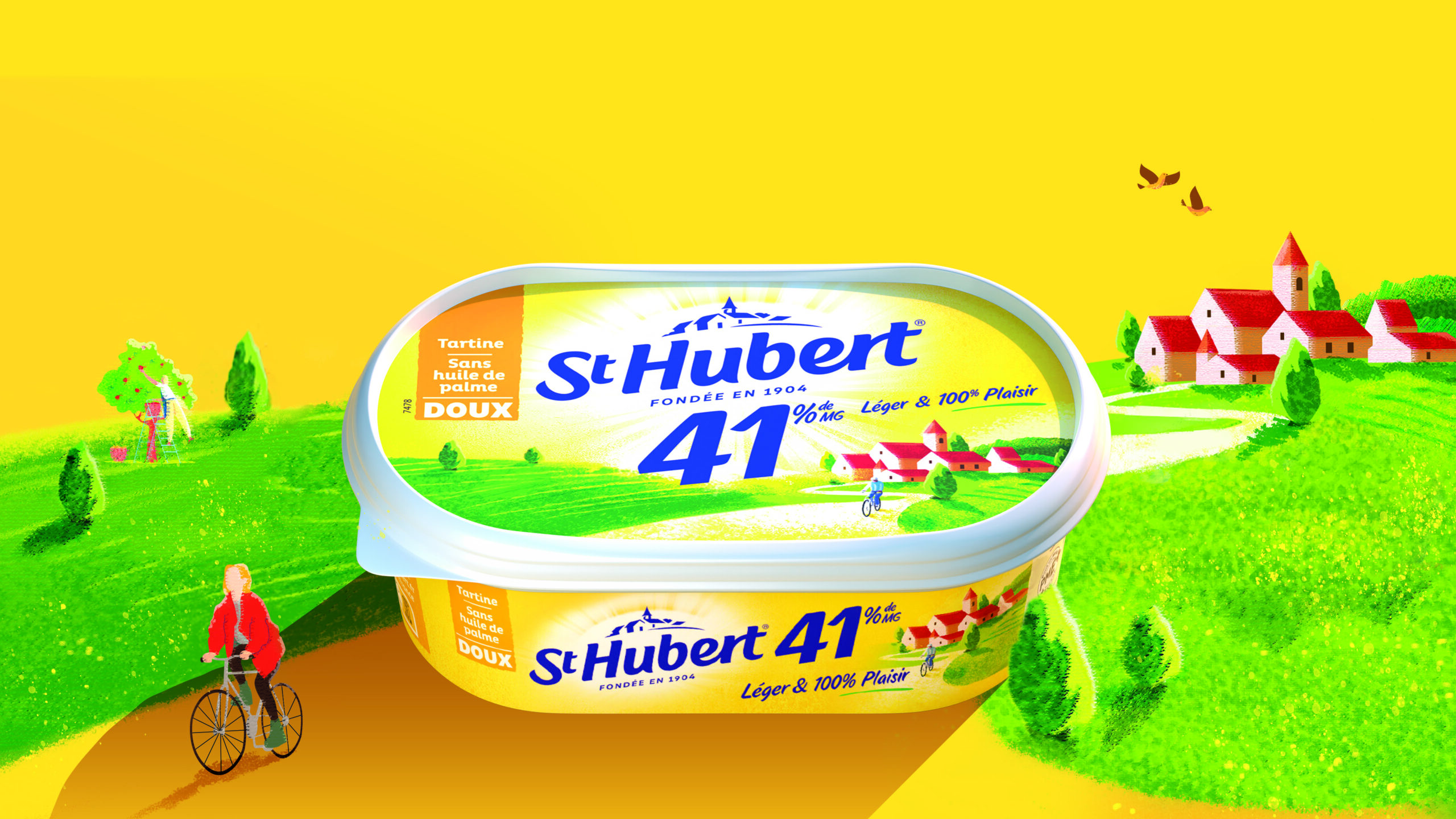
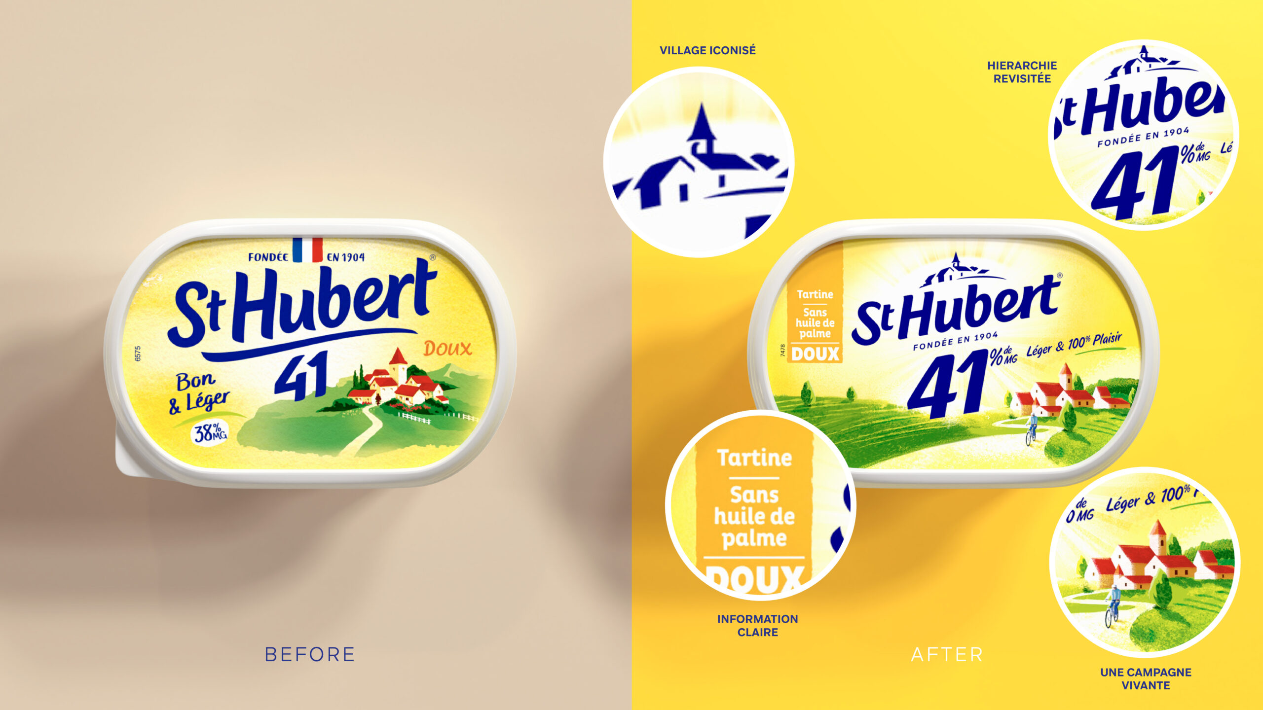
Our recommendation: tap into the brand’s strong emotional capital by crafting a unique and ownable narrative—“positive rurality”—rooted in the iconic St Hubert village and the brand’s legacy of natural goodness and simplicity.
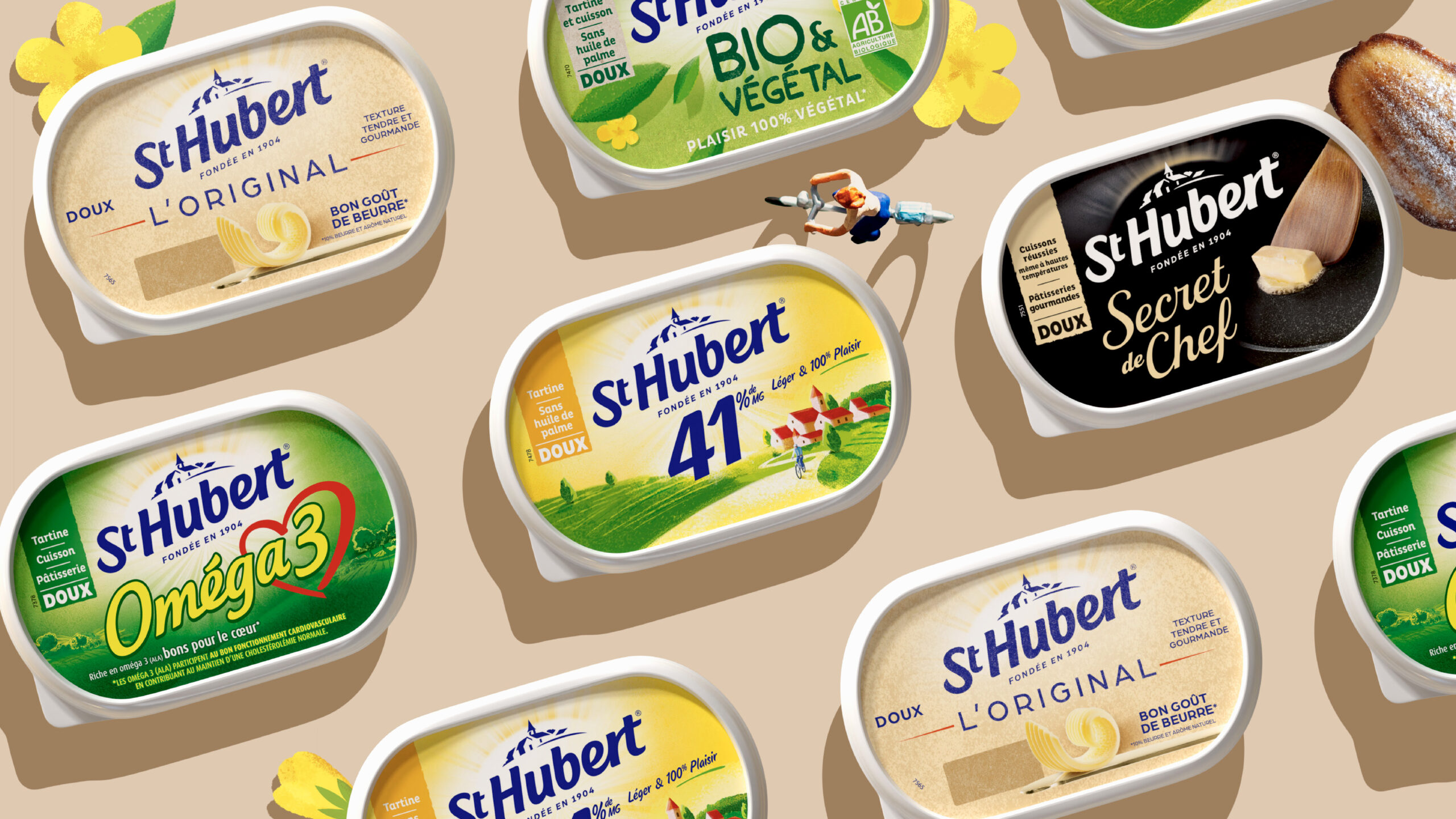
We restructured the range for greater impact:
– St Hubert 41: clearer messaging to attract new users while reinforcing leadership.
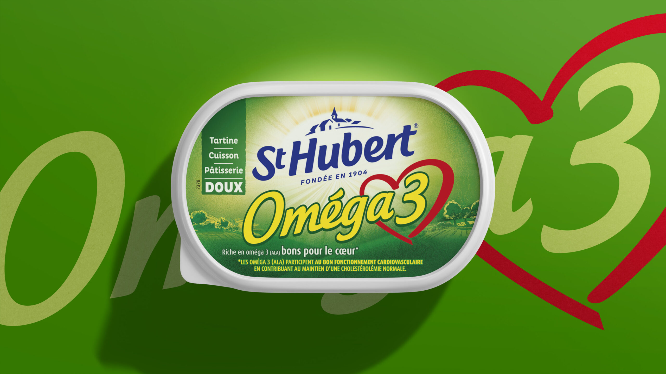
– St Hubert Omega 3: more distinctive health benefits and strong shelf standout.
We also designed packaging for two category-disrupting launches:
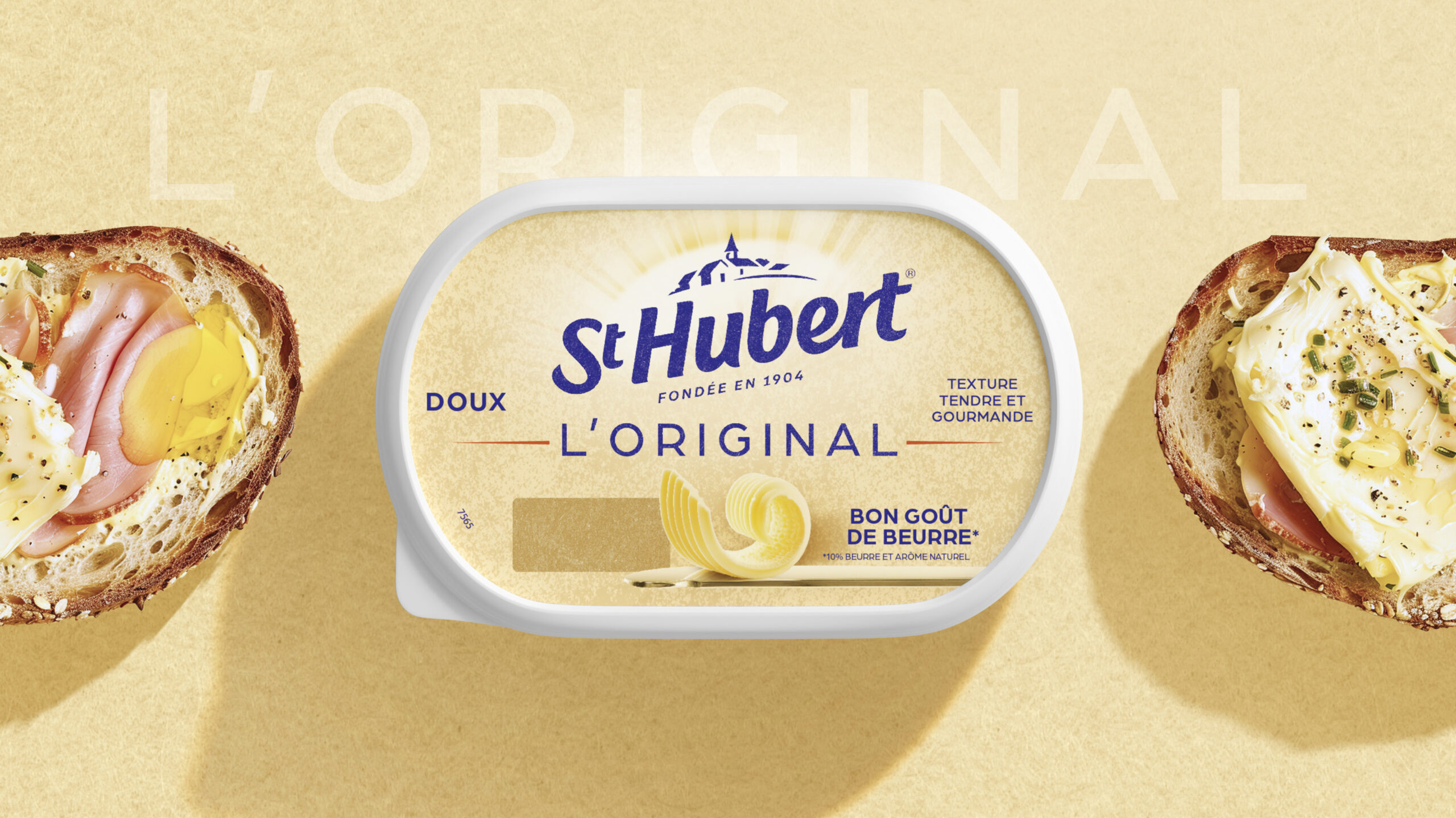
– St Hubert L’Original, with creamy indulgence and a modern, soft aesthetic.
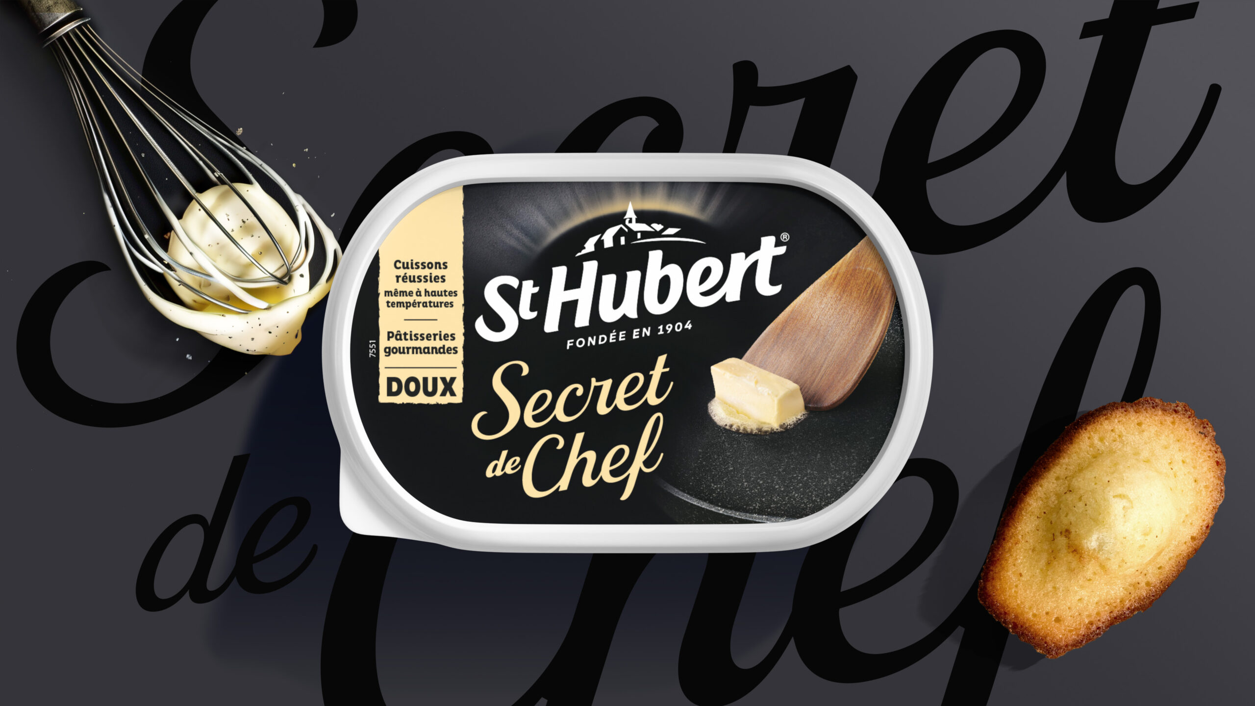
– St Hubert Secret de Chef, aimed at food lovers with premium culinary codes, using black—a unique color in the category.
From a revamped brand structure to a refreshed logo, St Hubert is ready to reclaim its place in French kitchens with emotion, clarity, and innovation.
Selected work
Dove
View case study

Renault
View case study

PrestaShop
View case study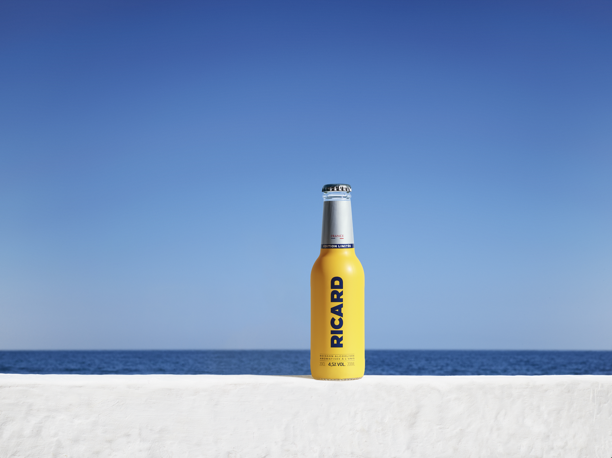

Ricard
View case study

Ferrero
View case study

Sanofi
View case study

Clarins
View case study

Rexel
View case study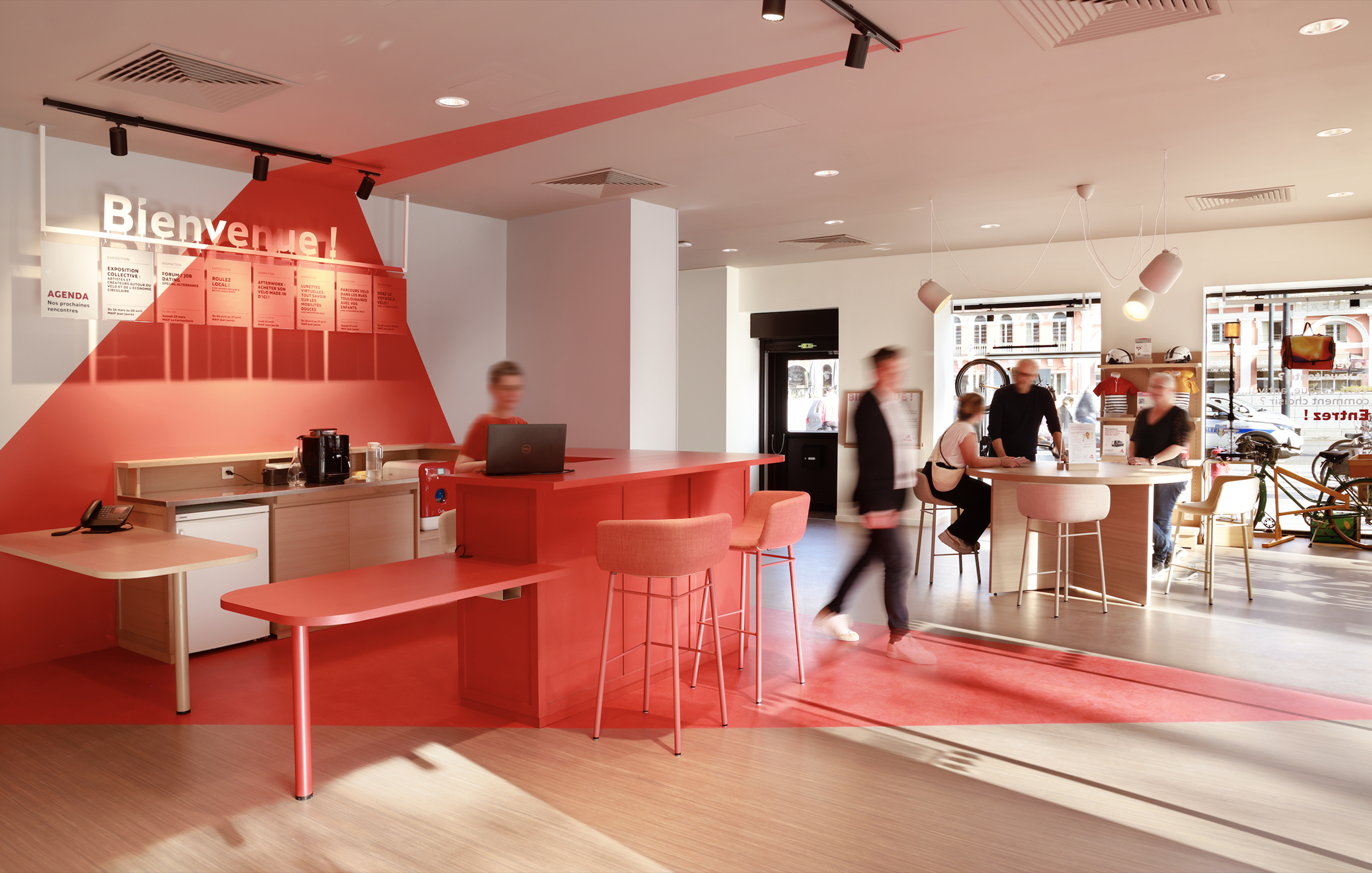

MAIF
View case study

Santé Verte
View case study

Maggi
View case study
Tiger Beer (Heineken Group)
View case studyDove
View case study
Renault
View case study
PrestaShop
View case study
Ricard
View case study
Ferrero
View case study
Sanofi
View case study
Clarins
View case study
Rexel
View case study
MAIF
View case study
Santé Verte
View case study
Maggi
View case study
Tiger Beer (Heineken Group)
View case study
Renault
View case study
PrestaShop
View case study
Ricard
View case study
Ferrero
View case study
Sanofi
View case study
Clarins
View case study
Rexel
View case study
MAIF
View case study
Santé Verte
View case study
Maggi
View case study
Tiger Beer (Heineken Group)
View case studyDove
View case study
Renault
View case study
PrestaShop
View case study
Ricard
View case study
Ferrero
View case study
Sanofi
View case study
Clarins
View case study
Rexel
View case study
MAIF
View case study
Santé Verte
View case study
Maggi
View case study
Tiger Beer (Heineken Group)
View case studyDove
View case study-
Dove
View case study -
Renault
View case study -
PrestaShop
View case study -
Ricard
View case study -
Ferrero
View case study -
Sanofi
View case study -
Clarins
View case study -
Rexel
View case study -
MAIF
View case study -
Santé Verte
View case study -
Maggi
View case study -
Tiger Beer (Heineken Group)
View case study -
Dove
View case study -
Renault
View case study -
PrestaShop
View case study -
Ricard
View case study -
Ferrero
View case study -
Sanofi
View case study -
Clarins
View case study -
Rexel
View case study -
MAIF
View case study -
Santé Verte
View case study -
Maggi
View case study -
Tiger Beer (Heineken Group)
View case study