THE BRIEF
At the beginning of 2022, several questions were asked by the insurer, in a context of disaffection of its physical branches, accentuated by the covid period, and to cope with the evolution of consumption patterns and consumer expectations, especially those in their thirties:
How to make insurance agencies attractive, especially for a strategic target in their thirties? How to create traffic and conversion at the point of sale?
What omnichannel distribution strategy should the brand adopt? Which mix is the most relevant from a customer point of view?
What scripting of agency formats? What customer and employee experience? What product and service offerings?
THE RECOMMENDATION
Our teams worked on a new strategy for the network’s location, designing new, distinct, and complementary formats for consumers, prospects and employees, integrating the network’s capacity, organizational and design challenges. MAIF is reinventing its local relationships to adapt to consumer habits and the specific characteristics of each region.
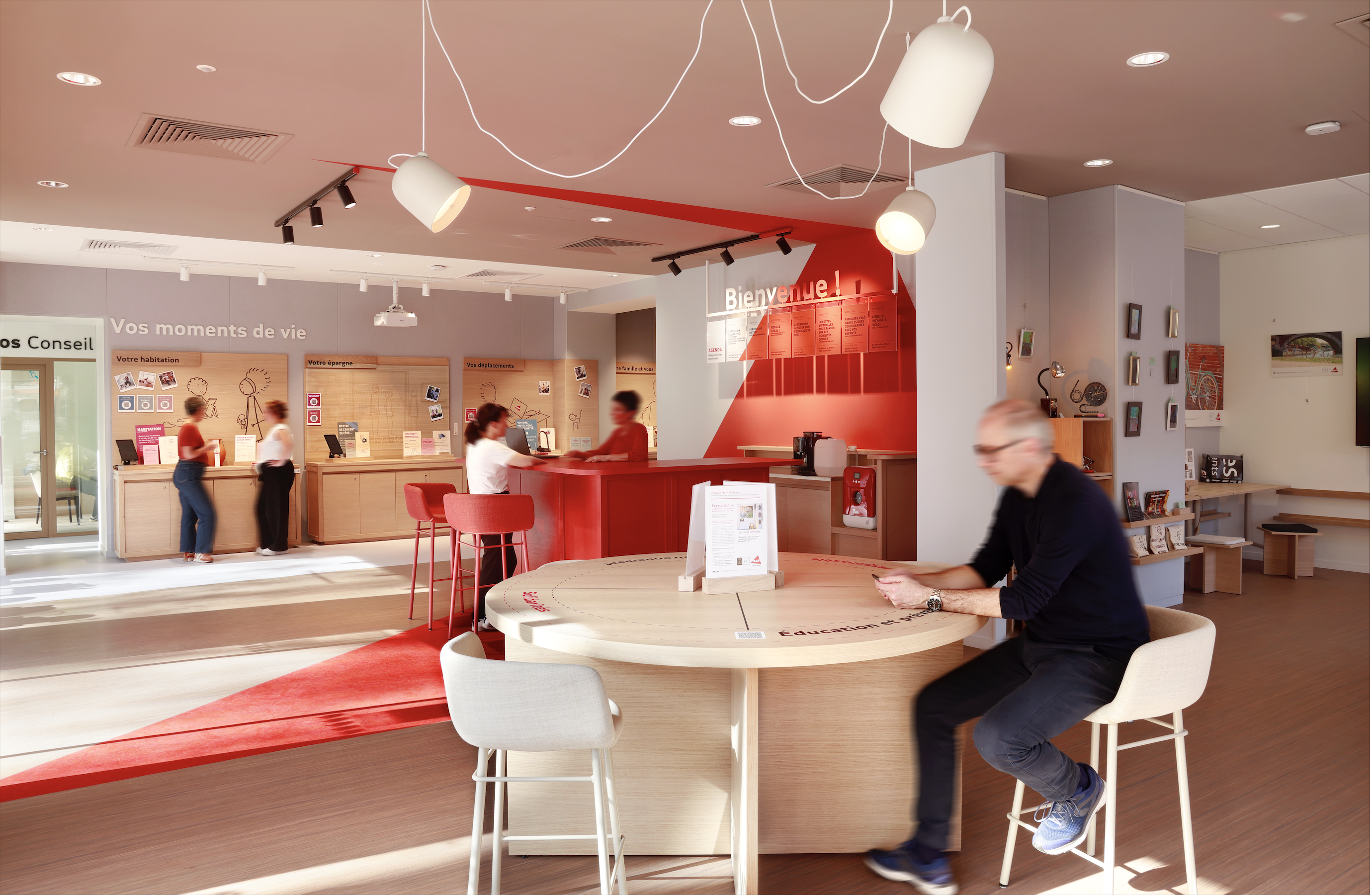
The result: an agile concept, aimed at more urban audiences, designed as a place for advice, where the in-branch experience encourages a “return to the physical”, enabling value-added operations to be carried out thanks to advisors and experts.
To enable MAIF to redeploy its network geographically, our teams have defined several POS formats, including a flagship adapted to large cities, with a surface area of over 200m2 and a rich program; a standard format for city centers, designed according to retail codes; and a smaller, local format, to get MAIF seen in high traffic locations. MAIF is beginning to experiment with the insurance agency of tomorrow, in four pilot towns: Anglet, Toulouse, Rennes and Lille.
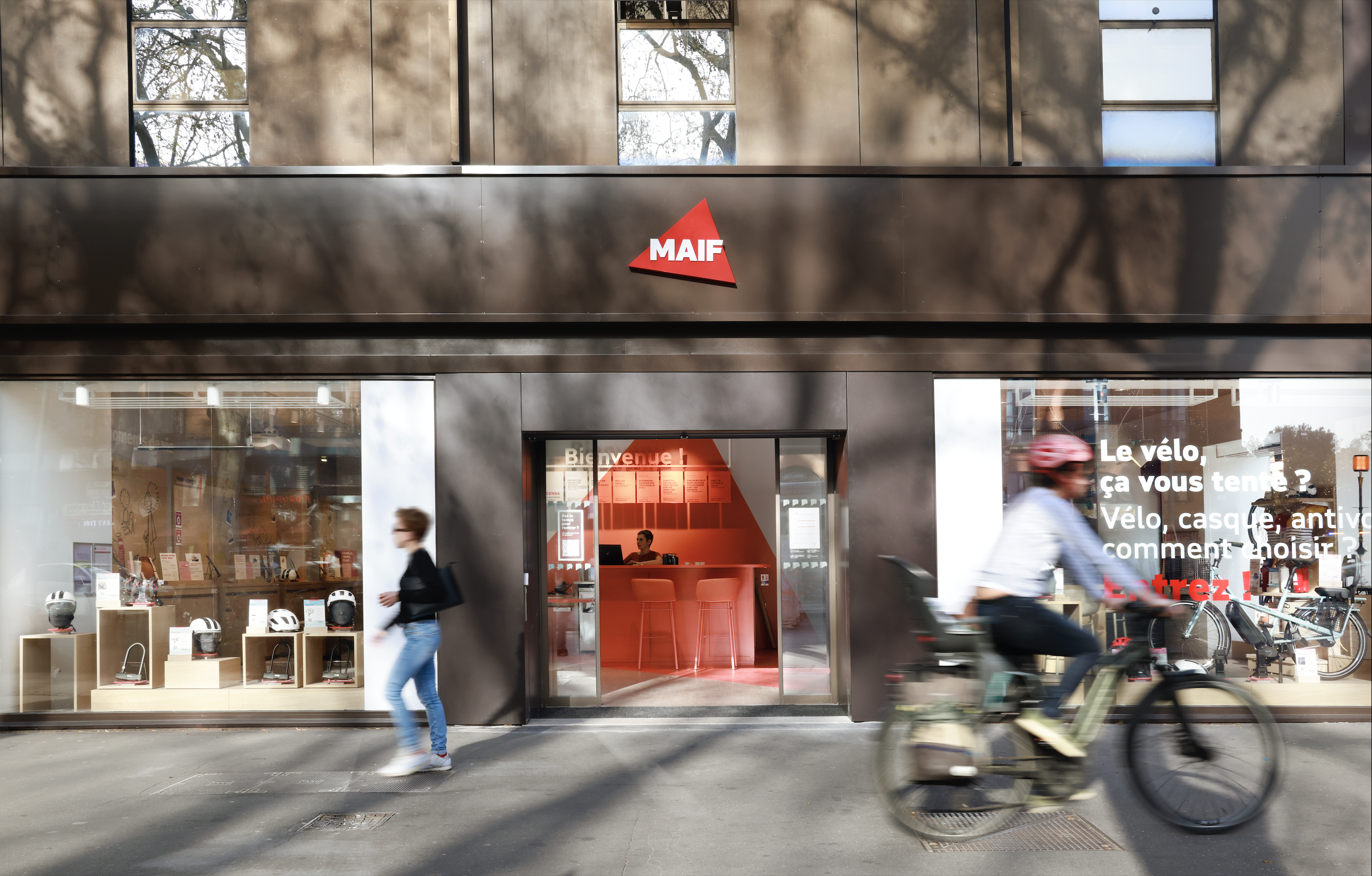
In all formats, our teams introduced MAIF’s distinctive design markers. Inside the branches, the brand’s red triangle logo, treated in anamorphosis, highlights the advice desk and the “Café Bienvenue”, both a place and ritual of welcome, inspired by the codes of the counter. The anamorphosis was designed as a strong sign of recognition, visible from the outside.
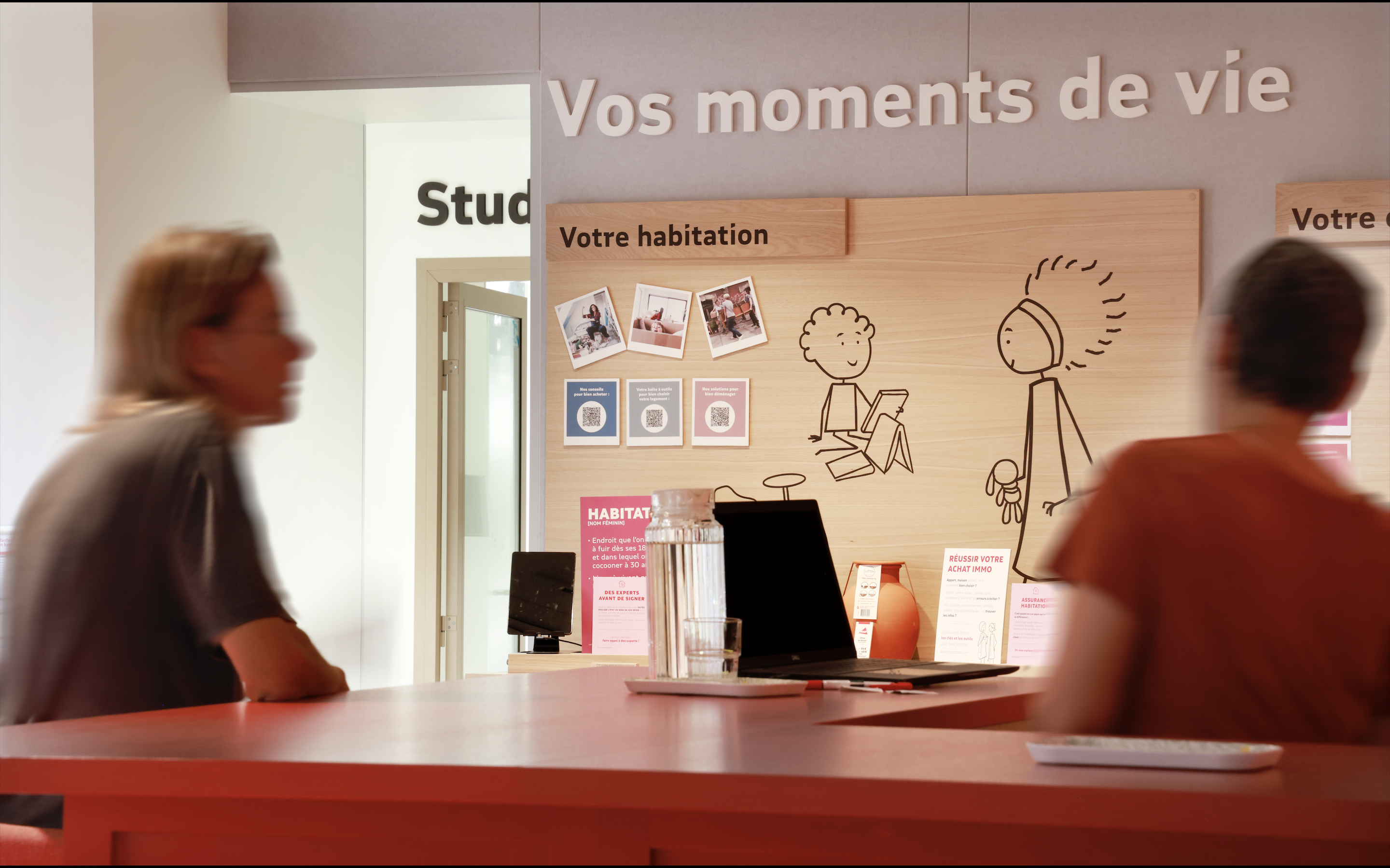
To meet the strong demands of the customer experience and the need for support, our teams also designed the “MAIF gallery”, a wall dedicated to the offers to embody the 4 themes of life’s moments: housing, family, travel, savings.
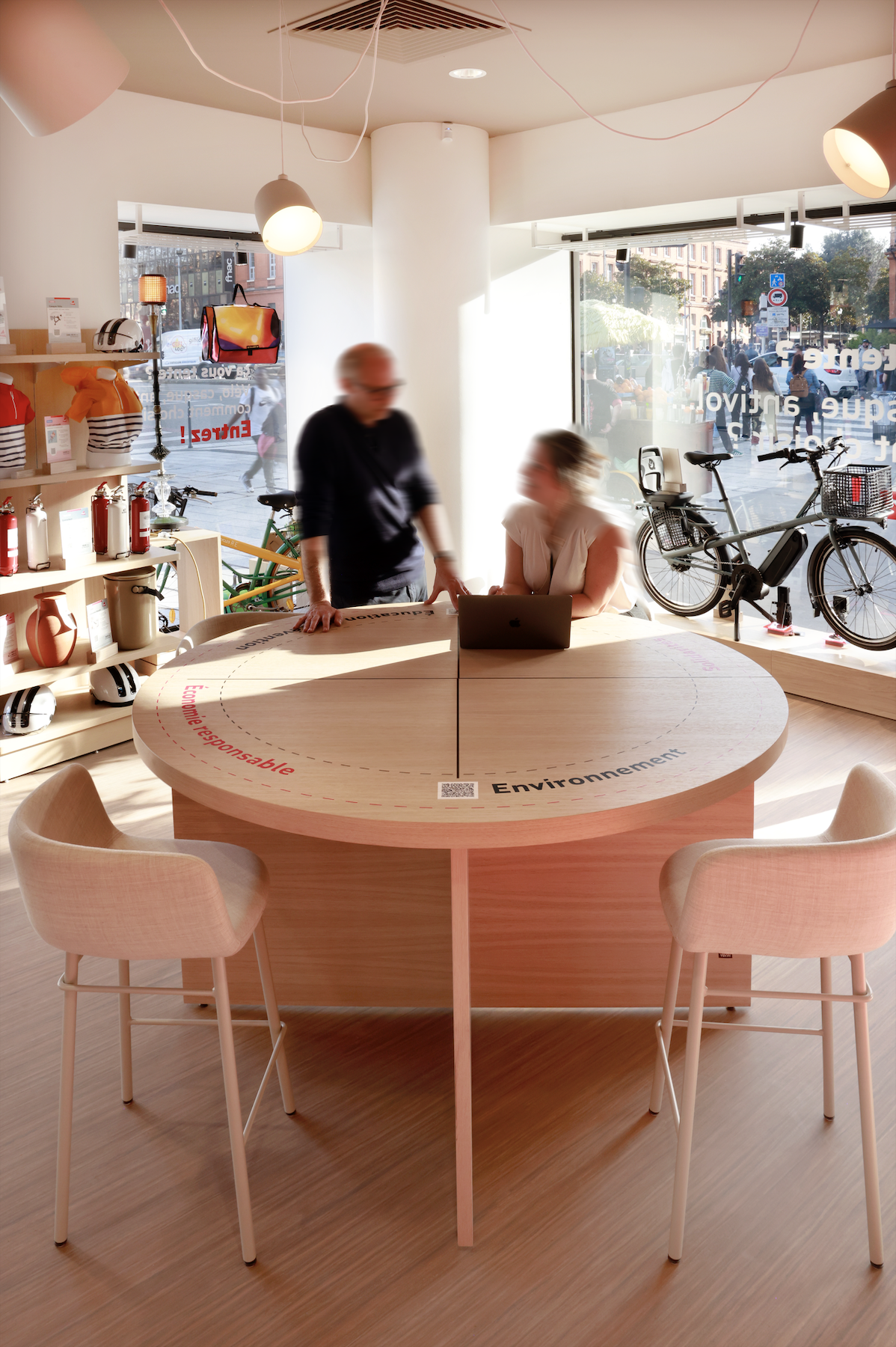
As a company with a mission, MAIF has ensured that all materials and furniture are sourced for their environmental qualities. This choice is explained by “Eco Labels” placed throughout the customer journey.


