The brief
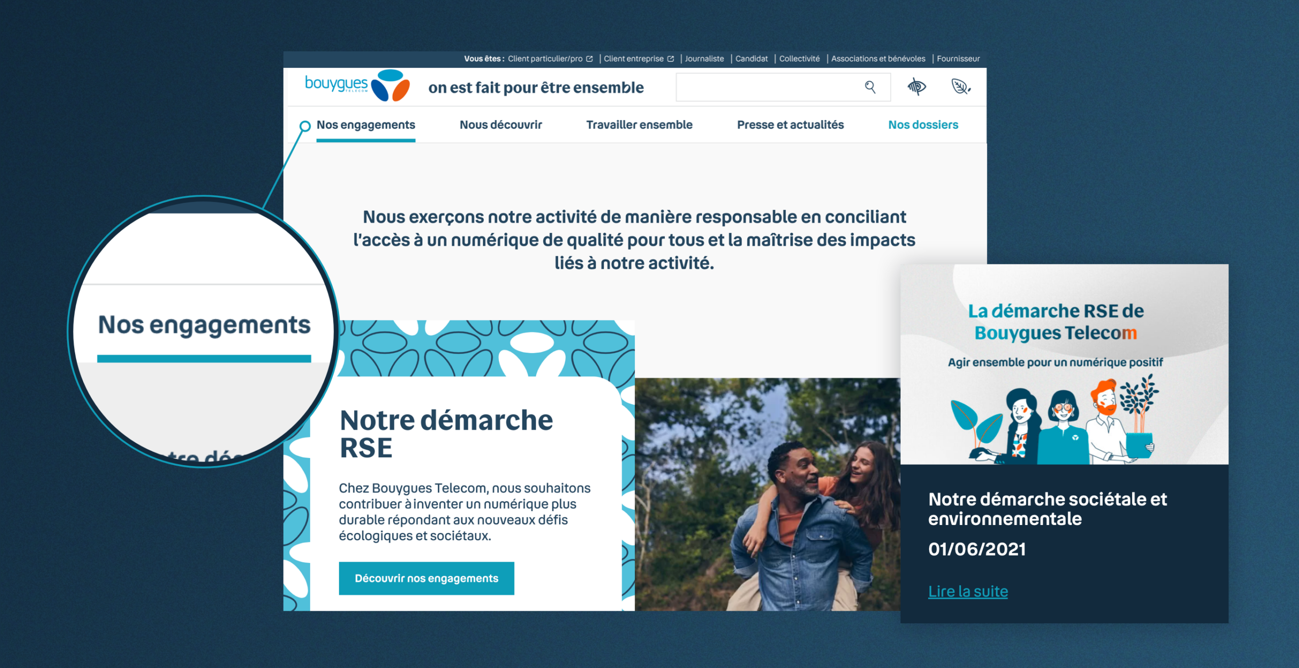
At a time when the brand has adopted a new signature and a new charter, Bouygues Télécom entrusted us with the task of rethinking and redesigning its corporate website (positioning, editorial line and graphic territory). The objective was threefold: to promote and support Bouygues Télécom’s CSR commitments, to integrate the brand’s new identifiants (a brand that is close, innovative, committed and differentiating), and to work on the coherence of the path between the different digital spaces to facilitate navigation and access to content, in line with new uses.
Our recommendation
A mobile first and accessible site
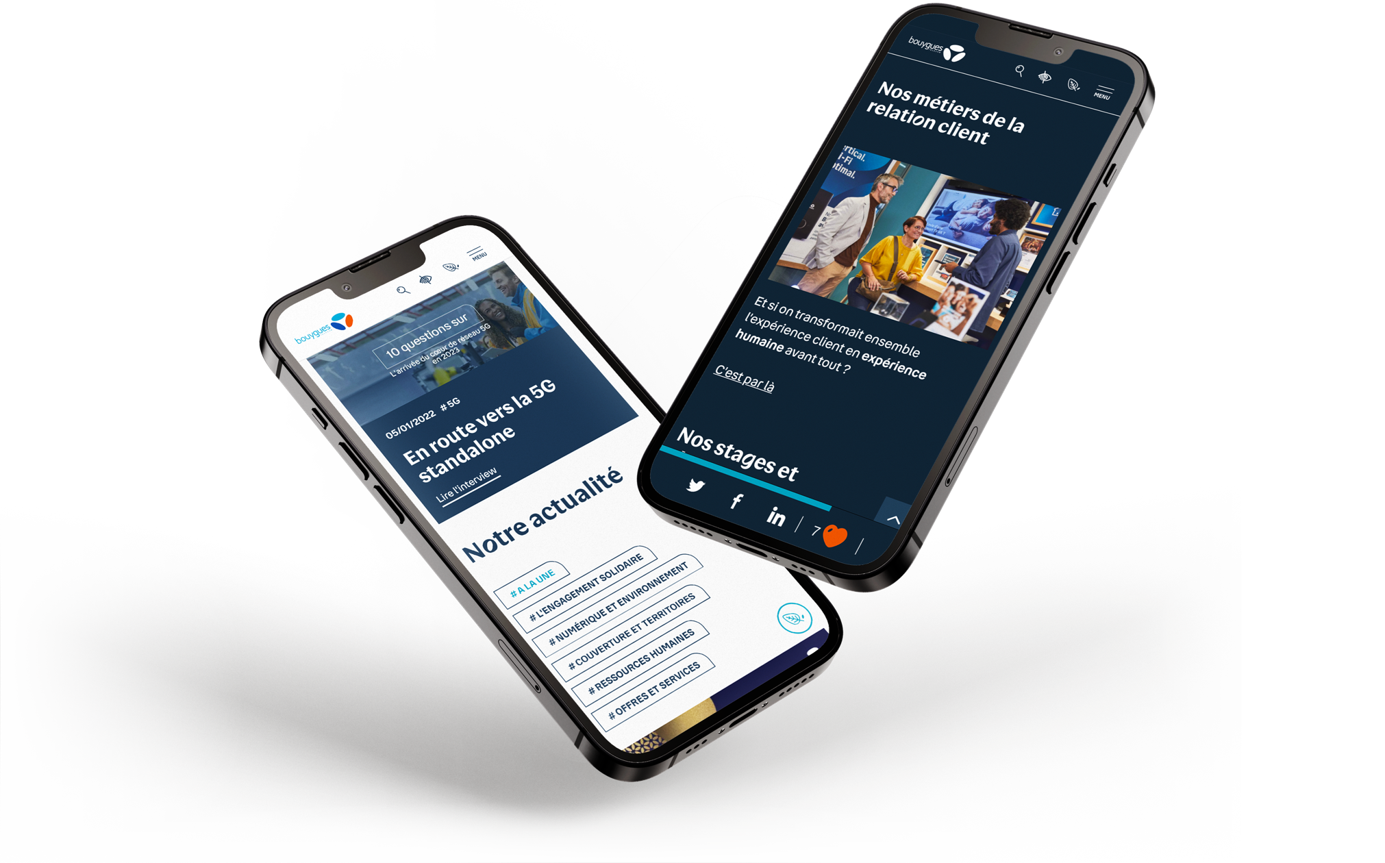
The agency carried out this redesign by introducing a more user-centric approach. Thematic entries were set up to offer navigation allowing users to enter the content by target, theme or content type. Designed in mobile first, the corporate site offers useful and accessible content thanks to an immersive navigation allowing direct access to information.
An eco-designed site
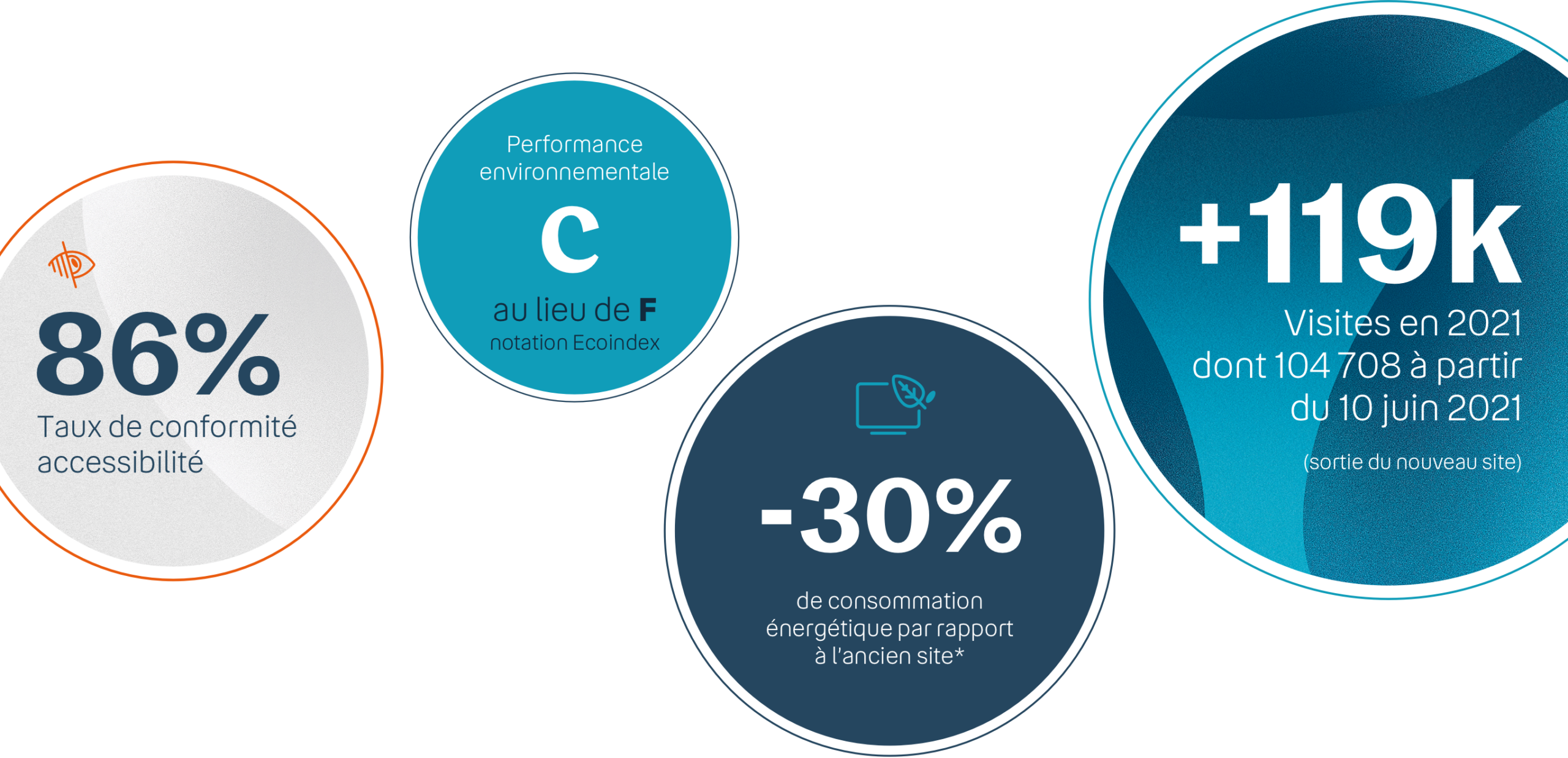
Bouygues Telecom’s corporate site is eco-designed (implementation of a dark mode, reduction of media and animations, optimization of techniques to reduce carbon emissions).
A dynamic homepage
Specific work has been carried out on the homepage to increase its dynamic dimension. Rich, hot content is regularly uploaded, highlighting the major issues and key topics of Bouygues Telecom. Lonsdale assists the Communications teams in the production of content.
Particular attention paid to CSR commitments
The major CSR commitments and the Corporate Foundation are particularly visible in this first section of the site, which is highly developed and rich in content.
Premium content production
The agency also designs the content to animate the corporate site editorially. Among them, prospective articles have been developed in partnership with Usbek & Rica.


