Pierre & Vacances, Europe’s leading holiday maker, is entering a new stage in its history by unveiling its brand new platform.More modern, international, upscale and fully rooted in digital, it embodies the renewal of the brand and the diversity of its offers.
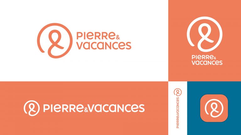
The result of a close collaboration with the agency, the new logo for Pierre & Vacances is the fifth since its creation. Modern, elegant and friendly, this new logo includes a monogram which can appear alone. Inspired by the brand’s ampersand, it offers infinite possibilities and illustrates a circle of well-being, placing the human in the center. Major and distinctive symbol for the brand, it values the idea of connections. It adapts to all media and fully integrates into the digital era while offering Pierre & Vacances a strong and recognizable image, both in France and abroad.
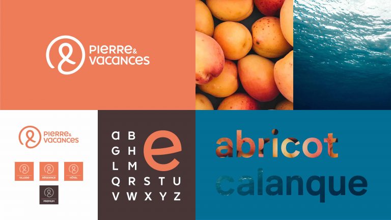
With smiling characters, the custom-made typography is expressive and unique. With its modern look, it was designed to create complicity with the public of the brand.

The color scheme includes two colors: “apricot” and “cove”. Apricot, which is a brand new color, gives the taste of the holidays by diffusing vitamins and good spirits with its fruity and sunny hue. It is accompanied by cove, a deep blue tone, soothing and refreshing. This adds a very natural and soft universe to highlight the premium offers of the brand, shown in the woody color of Wengé and a specific secondary color scheme. Pierre & Vacances also asserts its brand in a unique way. The different offers are presented as different experiences.

“By installing the ampersand first in the reading direction of the logotype, we created a strong and unique symbol in the history of the brand. With a circular gesture and a single stroke, the symbol creates a link. Other evocations are offered, such as an infinite sign, a human or the letter “P”, the initial of Pierre & Vacances. The simplicity of the design and the universal dimension of the symbol allows the logotype to be integrated perfectly into a territory with an abundance of brands and to find a unique space among the visuals,” comments Ivan Froment, Creative Director at Lonsdale. Revealed Monday October 1st through its new campaign for the winter on TV, on websites, on social networks and digital applications, the new visual identity will be rolled out gradually on all Pierre & Vacances sites in France and abroad.


