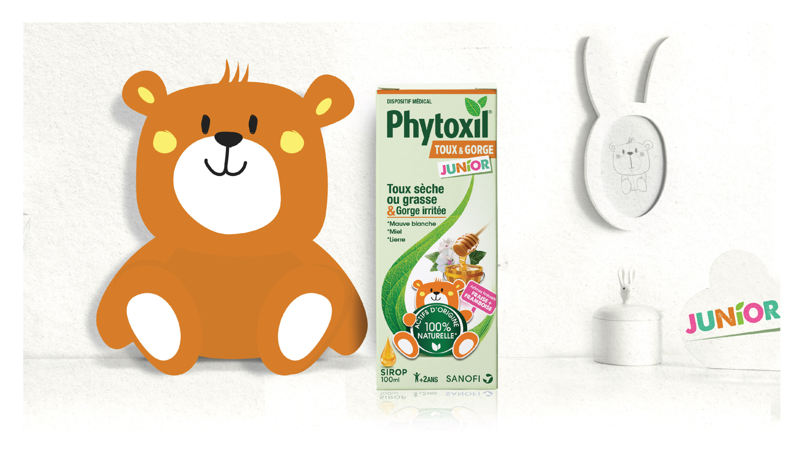
Phytoxil

(Sanofi)
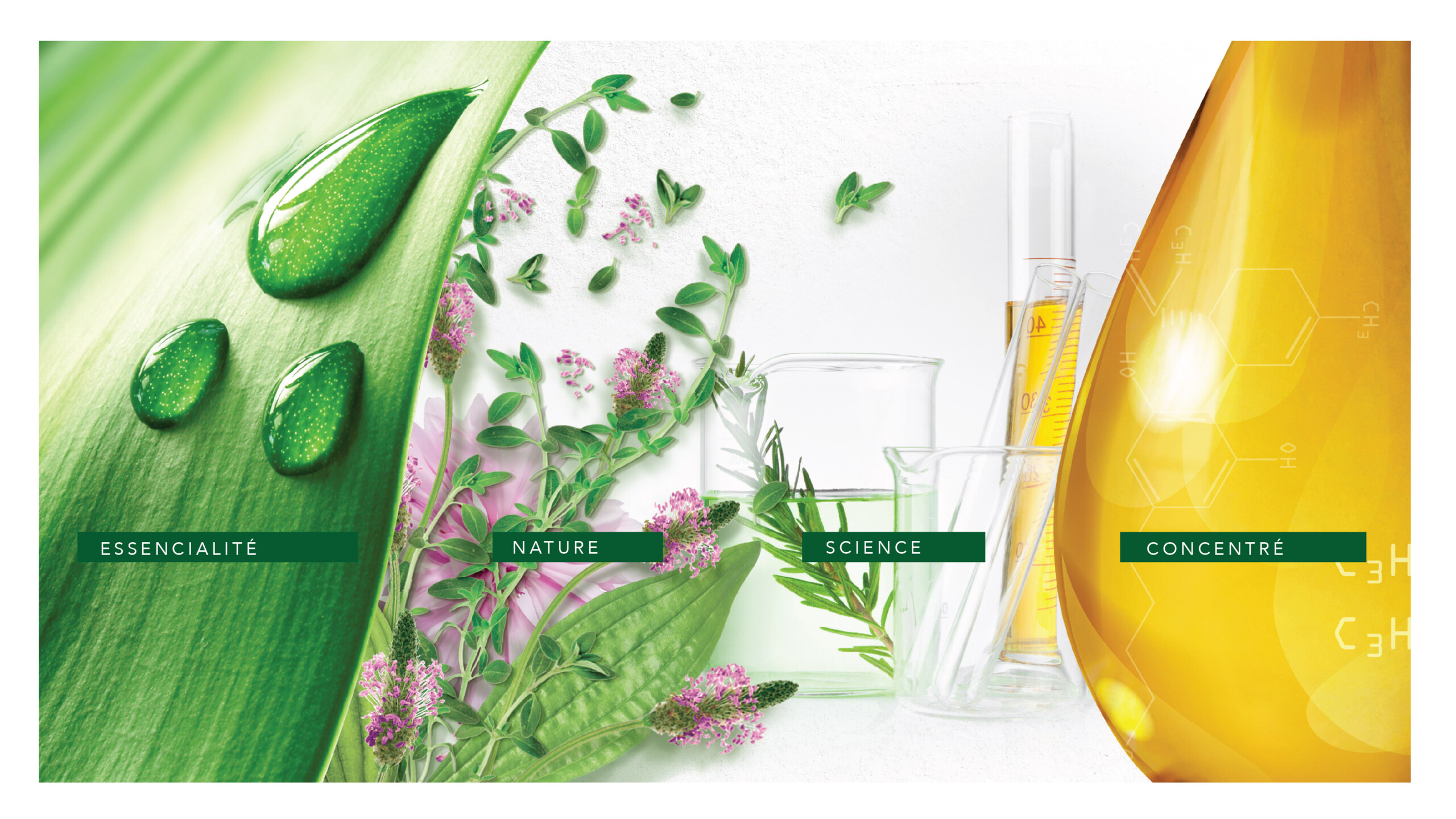
Where Nature Meets Science

The brief

Sanofi wanted to make Phytoxil an independent brand in the territory of naturalness to accelerate its growth, increase its notoriety, and become part of its consumers’ daily lives.

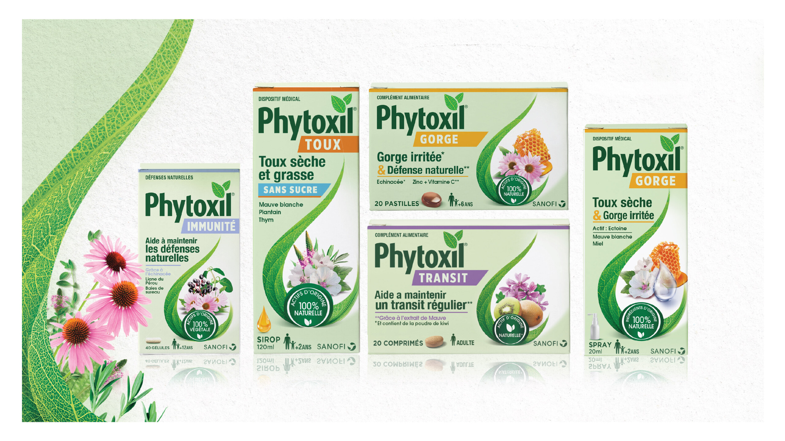
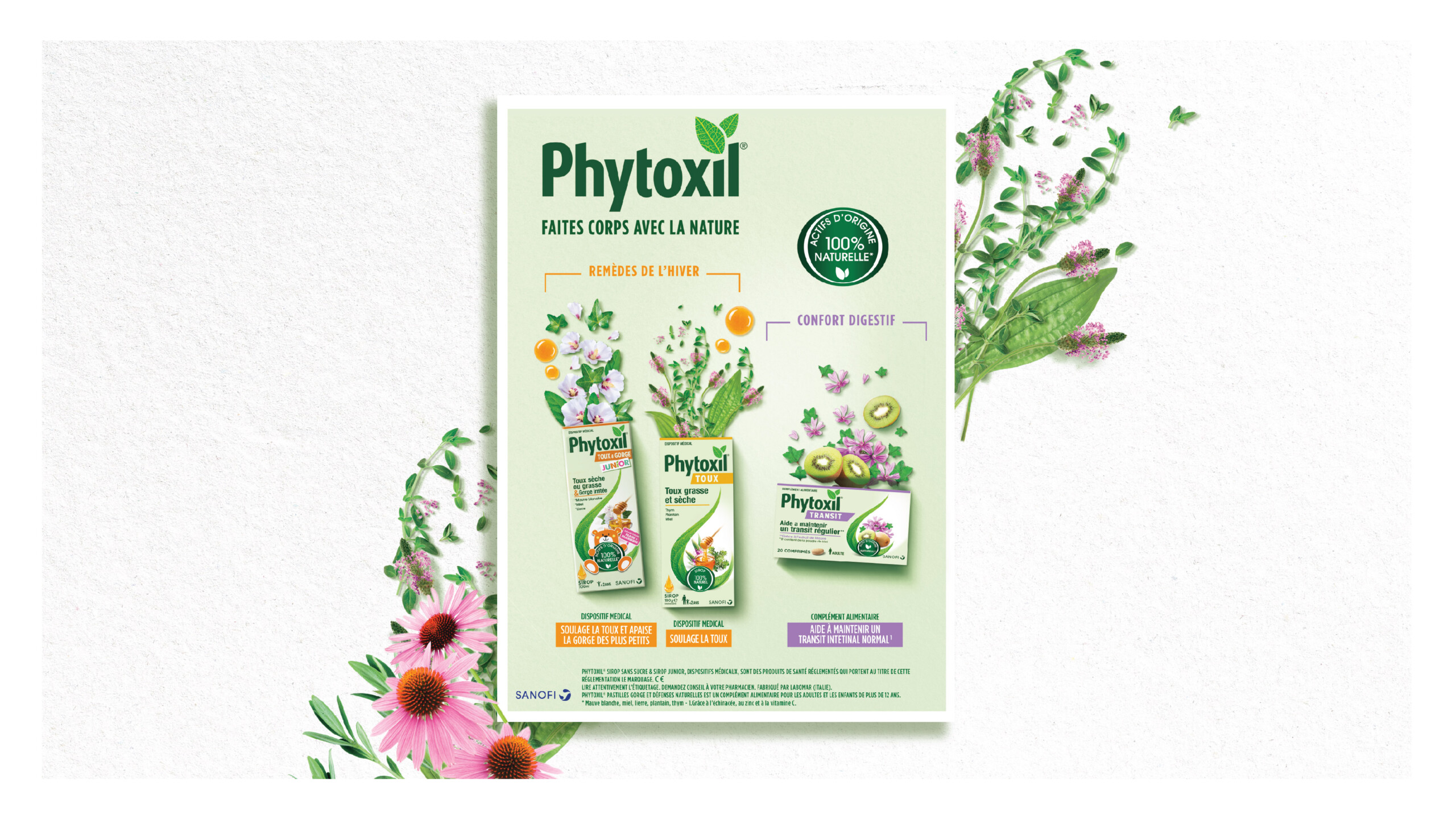
Originally built on the cough products segment, the brand wanted to expand its remedies to new pathologies. Therefore, its new territory had to be flexible enough to allow for innovation and offer each range the opportunity to express its promises while ensuring good brand recognition for pharmacists and consumers alike.

Our Recommendation

Our challenges: finding the right balance between nature and science, identifying the best brand architecture to fully understand the breadth of the range and the diversity of its promises, and defining a stronger, more memorable and recognizable identity.

We first studied the territories of “Active Nature” to identify their codes and signs and understand how the direct competitors of the brand express themselves. This allowed us to identify the most suitable graphic territory for Phytoxil. We also studied the construction of the offer to define the segmentation system best suited to the brand’s needs and the proper interpretation by pharmacists and consumers.


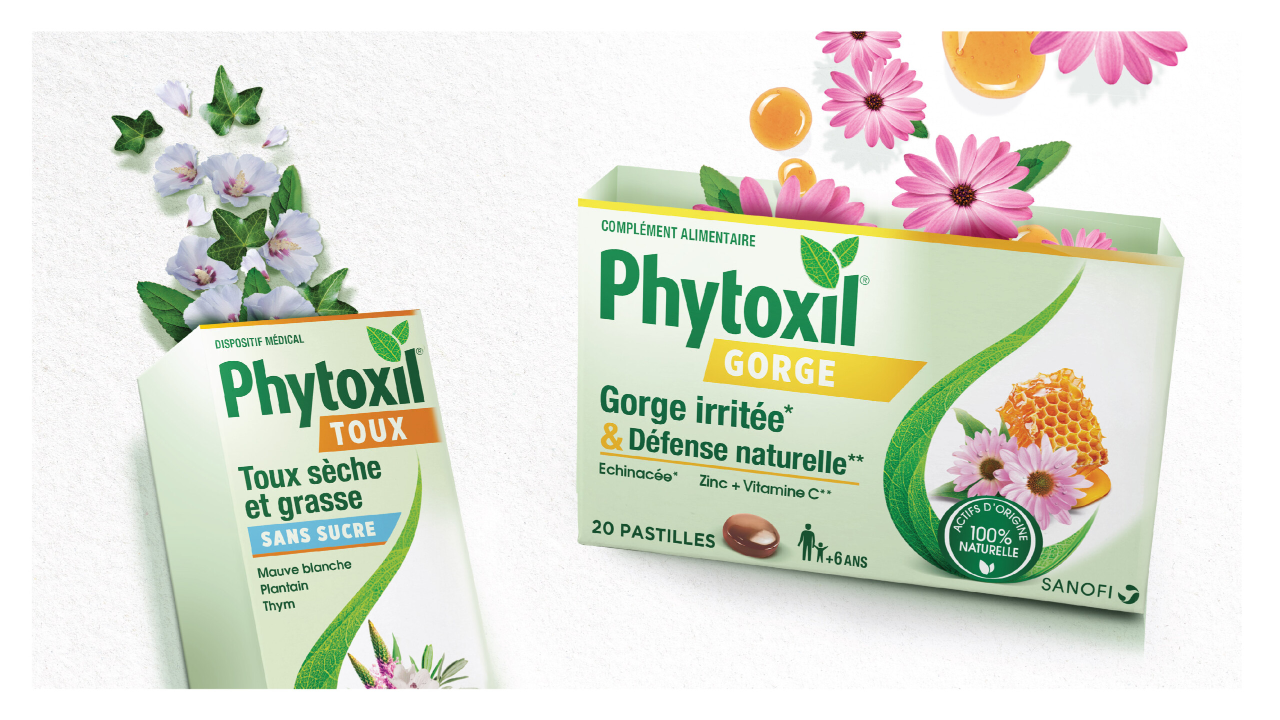
We relied on the brand’s historic key visual – the leaf. From there on, we reinterpreted it to make it more iconic and natural. We used a soft and natural, desaturated, almost pastel green color for the background, inspired by the world of cosmetics, a vector of well-being and care. This color, which has become transversal, thus became the brand color, distinguishing it from competitors with “health” codes while strengthening its identity. Finally, the typographical and iconographic choices were driven by the need to express transparency, harmlessness, purity and sincerity, thereby reflecting the brand’s values.