The brief
The complete overhaul of the brand responds to a double challenge: opening up to a broader and more demanding clientele and facilitating access to tailor-made products by promoting a new stylistic advice and support service.
Our recommendation
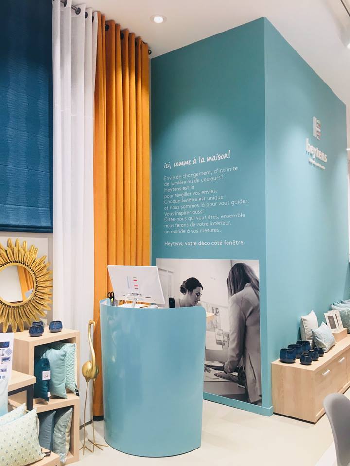
The brand signature “Heytens, your window decor” underscores the specificity of Heytens as a brand specializing in the recommendation and creation of custom-made curtains, drapes and blinds. We recommended new corporate colors that can easily be recognized from outside the store and that will bring to light the brand’s values of refinement, as well as its decorative core. Through its unique structure, Heytens’ new logo, an imaginative letter H, emphasizes the diversity of its offer, materials and colors.
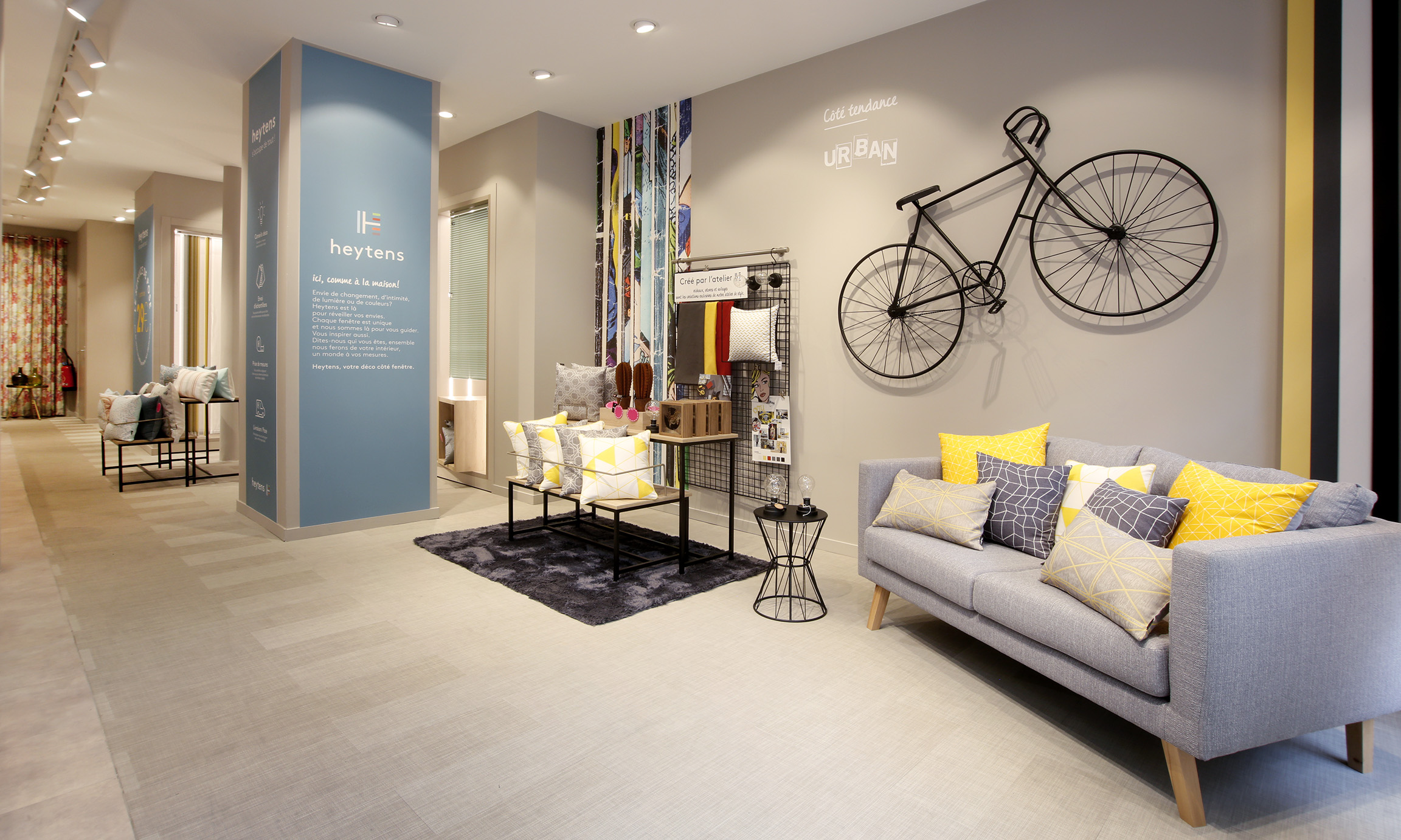
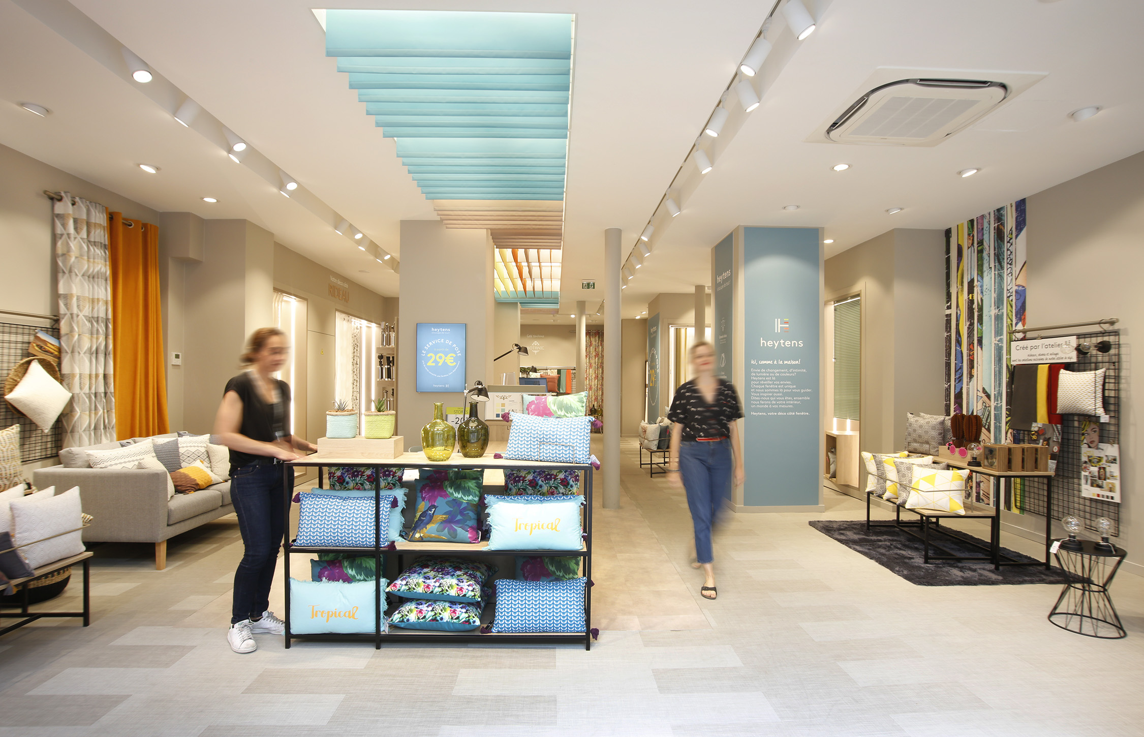
By reworking the store concept and customer journey, the agency added value to the brand’s manifesto and services from the outset.
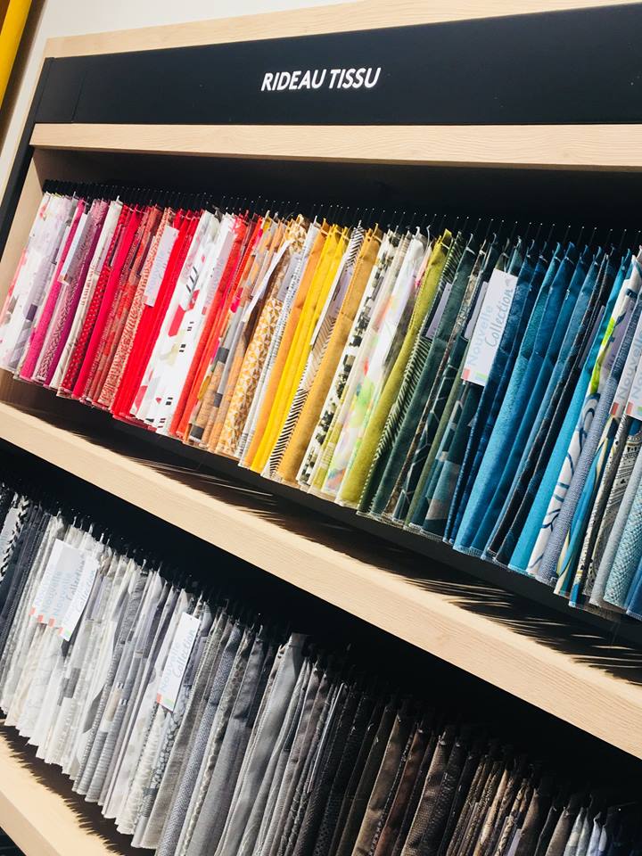
The aisles are henceforth organized around a central counter, reflecting the spirit of drapery tables. The merchandising consists of a “mural sample” that reveals a wealth of collections and renders the products by range of style, price, and by the technique used (textile or blind / panel) with the aim of clarifying the brand offering.
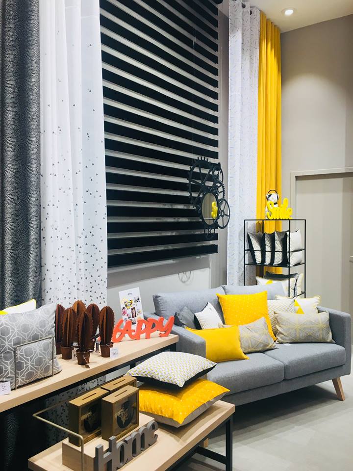
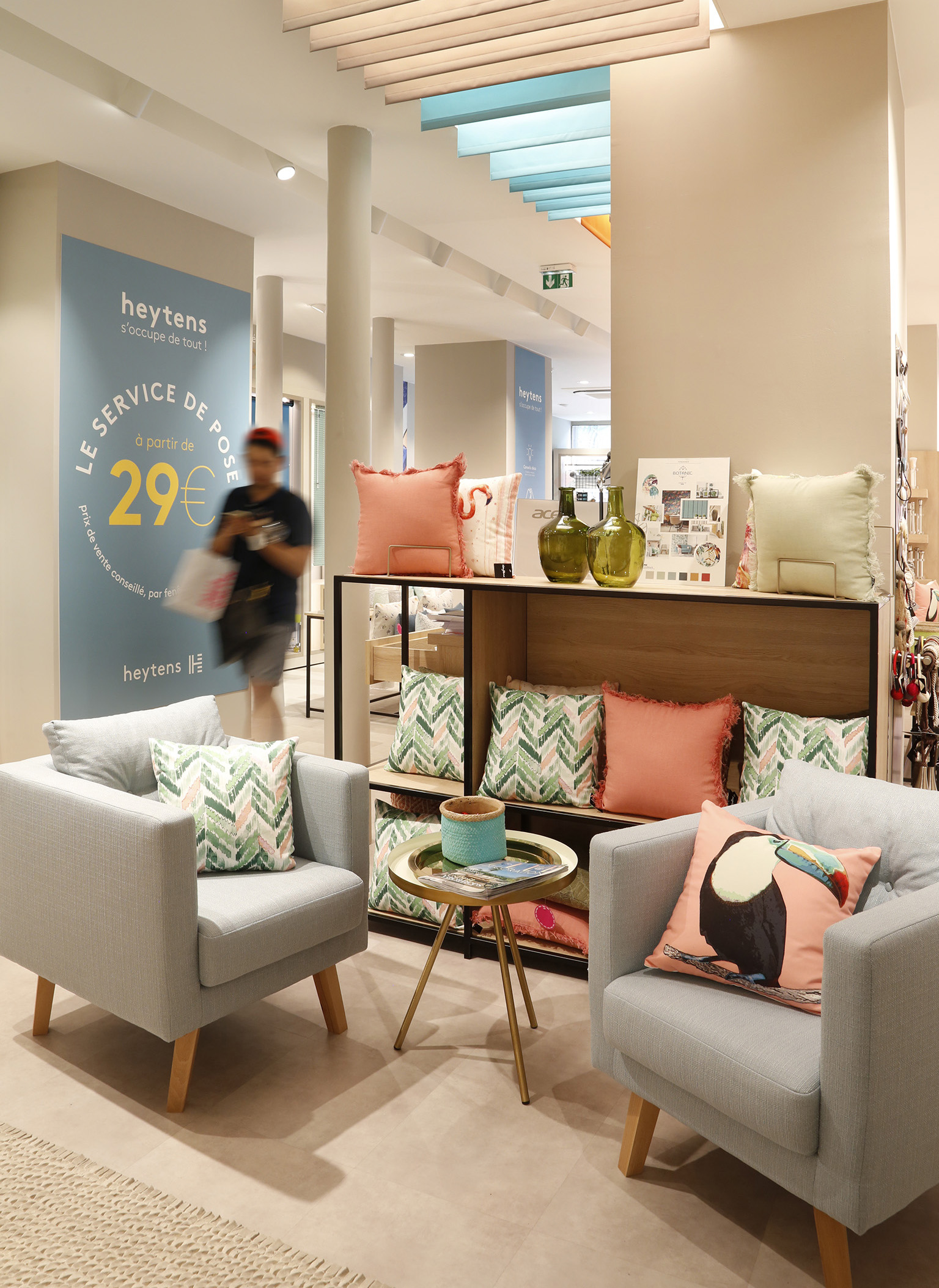
A new mural contains an array of decorative accessories (small furniture, lighting and cushion ranges) to encourage impulse buying. Mobile boxes on rails animate the point of sale by illustrating current trends and themes.
